A story about averages, neighborhoods, and the search for what really changed
You know that feeling when you look at an average and think, “that can’t be the whole story”? The headline was clear: Ottawa’s transit times increased by nearly 10 minutes. What that number couldn’t tell me was why, or for whom.
Ottawa spent roughly $7 billion transforming its transit system from the widely-admired Bus Rapid Transit into a modern Light Rail Transit (LRT) network. For the uninitiated Ottawa undertook a transformative project to add light rail across the city. The planned network rollout is shown below however a global pandemic, reliability issues, and financing disputes have led to the timelines slip well past the initial plans; as those living in Ottawa know all too well.
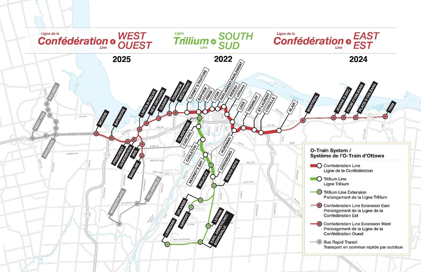
As of this analysis in September 2025, the Trillium line south was fully operational but the Confederation line expansion from Blair to Trim Station was still under construction with an estimated opening in early 2026. Similarly, the Western expansion to Moodie has been delayed, with significant impacts on the overall performance. The headline numbers suggest things got worse, transit trips are about 10 minutes slower on average than they were in 2019. But averages, as I’ve learned from years of digging into data, are just the beginning of the story. They’re the invitation to look deeper.
My colleague Mahtab and I rolled up our sleeves, began diving into the data to uncover the impact of the LRT system on Ottawa; and how car and public transit commutes have changed between 2019 and 2025. I’ll go through the methods and approach we used, start digging for insights and data, weaving in elements of population and census data, international research on the levers used to change transit behaviours, and uncover what has actually happened, neighborhood by neighborhood, since Ottawa added light rail to its transit network.
The start of every good data story: robust methodology
Here’s the thing about understanding data in any context — you need to be rigorous about rooting in strong, explainable methodology. Our team created what I like to call a “repeatable grid” across Ottawa. Picture the city divided into 500m × 500m squares, like a giant chess board. Drop a pin in the center of each square. Now measure how long it takes to get from that pin to World Exchange Plaza (our downtown benchmark) at different times of day.
We did this for both 2019 (pre-LRT) and 2025 (with Phase 2 nearly complete). Every 15 minutes during morning and evening rush hours. Same methodology, same Google Directions API, same everything. Over 82,000 measurements across all neighbourhoods, time windows, and years later, we had our citywide X-ray.
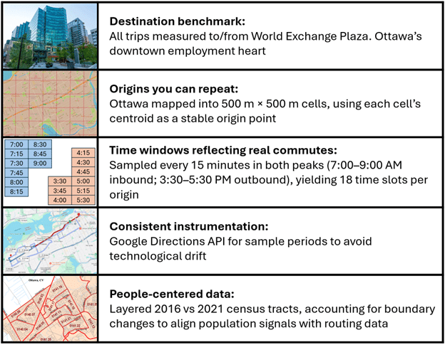
Then came the fun part: asking the right questions. How do real commutes actually work? What’s the difference between a 60-minute trip that feels manageable and one that feels impossible? To answer that, I layered in census and geographic data. Not just to see what changed, but for whom and where.
When averages tell half-truths
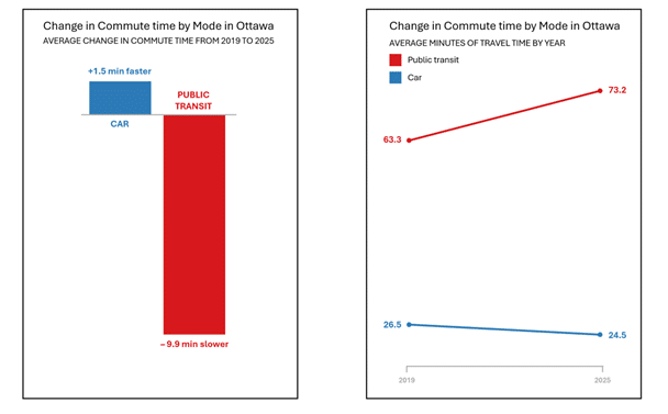
Let’s start with those citywide averages. Car trips to downtown got about 1.5 minutes faster. Transit trips got 9.9 minutes slower, pushing the average to 73.2 minutes. The transit-to-car commuter time ratio is now close to 3:1. Meaning a 10 minute Car trip nearly takes 30 minutes by transit.
That ratio matters more than the raw minutes. Transit research shows that when the transit-to-car time ratio drops below 1.5, people start choosing transit even when they own cars. Push it above 2.0, and transit becomes a last resort. The sweet spot, the “competitive band”, sits between 1.5 and 1.75.
So I plotted every single commute to see where Ottawa actually sits on this spectrum.
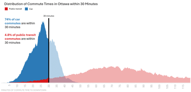
At 30 minutes, the pattern is already stark: 74% of car commutes reach downtown, but only 4.8% of transit trips. Transit is roughly 6 times slower than driving at this threshold.
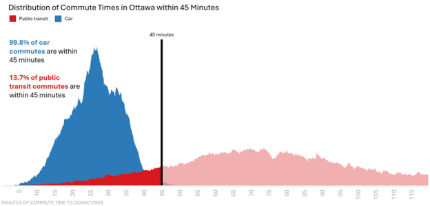
But here’s what matters for transit competitiveness: 45 minutes is exactly 1.5 times longer than 30 minutes, the edge of that competitive band. At this threshold, nearly all car commutes (99.8%) reach downtown. For transit? Just 13.7%.
This isn’t about whether transit is slower, everyone expects that. It’s about whether transit is competitive enough that someone with a car might still choose it. For the vast majority of Ottawa, it isn’t.
But citywide averages and distributions obscure as much as they reveal. Ottawa is too geographically diverse to analyze as a single unit.
Ottawa is a broad and diverse amalgamated city, the largest metropolitan area in North America by total land area. Lumping all neighborhoods into one analysis makes no sense when rural Cumberland, where dairy farms outnumber bus stops, sits in the same city as dense Westboro, where condos line every block.
We classified 97 neighborhoods by population density and distance from downtown core, creating four distinct zones that reflect Ottawa’s development patterns.

The geography of change
Breaking Ottawa into its natural regions revealed the first layer of nuance. This is where ridgeplots, layered distribution curves you’ll see below, revealed something the averages were hiding. The height shows how common that commute time is; the width shows the range. Overlaying 2019 and 2025 reveals shifts in the entire distribution, not just the average. Starting closest to downtown, Inner Urban neighborhoods barely felt the transformation.
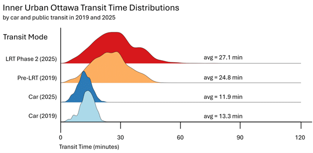
Transit times increased by just 2.3 minutes on average, while driving became 1.4 minutes faster. The status quo largely held for Inner Urban residents.
Moving outward, the picture gets more complex. Outer Urban areas sit in the middle distance. Far enough that small route changes matter, close enough that improvements are still possible.
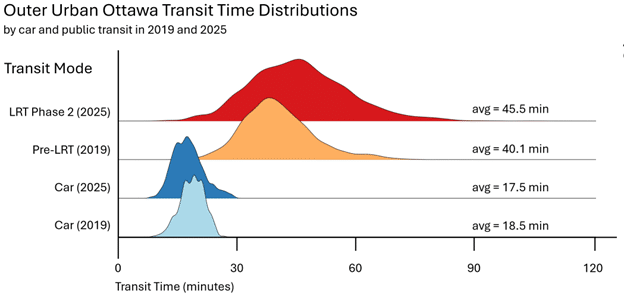
Outer Urban areas saw more variation. Transit times increased by an average of 5.4 minutes, with some neighborhoods like Pineview actually improving while others deteriorated significantly
But the further out you go, the starker the impact becomes. Here’s where the real impact hit: Suburban Ottawa.
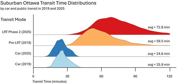
Suburban Ottawa bore the brunt of the change. Average transit times jumped by 13 minutes from roughly 60 to 73 minutes. That’s not a statistic; that’s 26 extra minutes every day, more than two hours per week, for real people trying to get to work.
And then there’s Ottawa’s rural fringe, where the question was never really about trains versus buses.
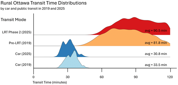
There aren’t many rural Ottawans who are going to sign up for an hour and a half transit trip to get to downtown when they can hop in their cars and get there three times faster.
Rural areas confirmed what we already knew: without density, transit can’t compete. But the three urban zones told a more complicated story: one that citywide and regional averages still couldn’t fully capture. Time to go neighborhood by neighborhood.
The neighbourhood view
Regional patterns told one story, but I kept thinking about the actual neighborhoods. Westboro, Barrhaven, Orléans. What happened to the specific places people actually live?
When I mapped car commute changes across all 97 neighborhoods, neighbourhoods that are red are slower now and ones that are blue are faster, an unexpected pattern jumped out. Pockets in the far west end saw car commutes slow by up to 5 minutes. But compared to transit impacts, this is minor.
Map 1 — Car Comparison
The score:
- 60 neighborhoods got faster by car
- 17 got slower
- 20 saw no meaningful change.
Cars won in nearly two-thirds of Ottawa’s neighborhoods.
Now for transit and the pattern flips. Using the same color scale, the map becomes almost a photographic negative. Where cars got faster, transit got slower. Where cars slowed slightly, transit sometimes improved. The only clear pattern? The farther you live from downtown, the worse your transit commute became.
Map 2 — LRT Evolution
Just 17 neighborhoods saw transit improvements. Even more striking: over half of all neighborhoods (50 of 97) experienced increases exceeding 10 minutes. I checked these numbers three times.
The maps revealed patterns, but they don’t answer the question every resident wants to know: where does my neighborhood rank? Here are all 97 neighborhoods, ordered from biggest winners to biggest losers. First by car, then by transit—and the contrast is striking.
While the map is awesome, also adding a simple bar chart showing the increase by Neighbourhood is useful … ordered by worst to best (actually improved).
Looking at these maps, I could see the what but not the why. That sent me searching for patterns. Distance from downtown? East versus west? Something else entirely?
Distance isn’t destiny
Distance seemed like the obvious answer. Farther neighborhoods should suffer more, that’s just geometry. Areas on the edge of the city are less dense, making it harder to coordinate bus routes and LRT schedules when housing spreads thin. The pattern should be simple: more kilometers, worse outcomes.
I tested this by plotting distance against commute change for every neighborhood. Distance on one axis, minutes gained or lost on the other, colored by region and sized by population.
The pattern wasn’t simple at all.
Start with the neighborhoods closest to downtown the Inner Urban core where you’d expect the LRT to work best.
The clustering is tight, and distance matters somewhat. Neighborhoods farther from downtown generally saw larger increases. But the effect is modest. Two neighborhoods at similar distances can differ by 4-5 minutes. Distance alone doesn’t explain the variation, even here.
Now add the Outer Urban ring, where the pattern should strengthen. Longer distances, more variability in route quality. Distance should dominate.
It doesn’t. The winners, neighborhoods that actually improved, cluster in the Outer Urban zone. But they’re not the farthest ones. They’re around 4-8 km out, with a tight cluster near the zero line. Meanwhile, at 8 kilometers, the data explodes. Neighborhoods with nearly identical distances diverge by 15 minutes. Greenboro East (8.3 km) is 6 minutes faster. Braemar Park-Bel Air Heights (8.1 km) is 9 minutes slower.
Distance isn’t driving this.
Add Suburban and Rural neighborhoods to complete the picture.
Now the disconnect is undeniable. Stonebridge and Orléans Avalon both sit 18 km from downtown. Equidistant within 200 meters. Post-LRT, their transit experiences diverged by over 11 minutes.
Same distance, vastly different outcomes. The answer isn’t in the kilometers. It’s in the connections. Let me show you exactly what I mean.
Comparing a trip from 772 Paul Métivier Drive in Stonebridge and a trip from 373 Selene Way in Orléans Avalon to World Exchange Plaza at 7:00AM
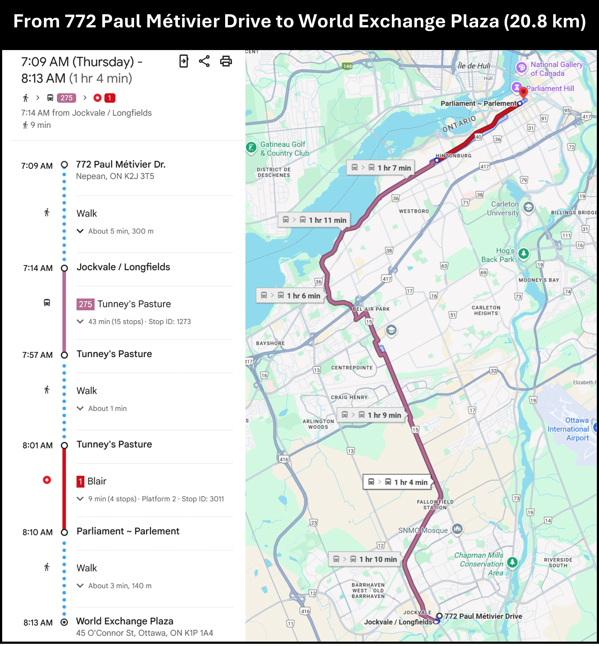
Stonebridge to Downtown: 1 hour 4 minutes, 43-minute bus ride.
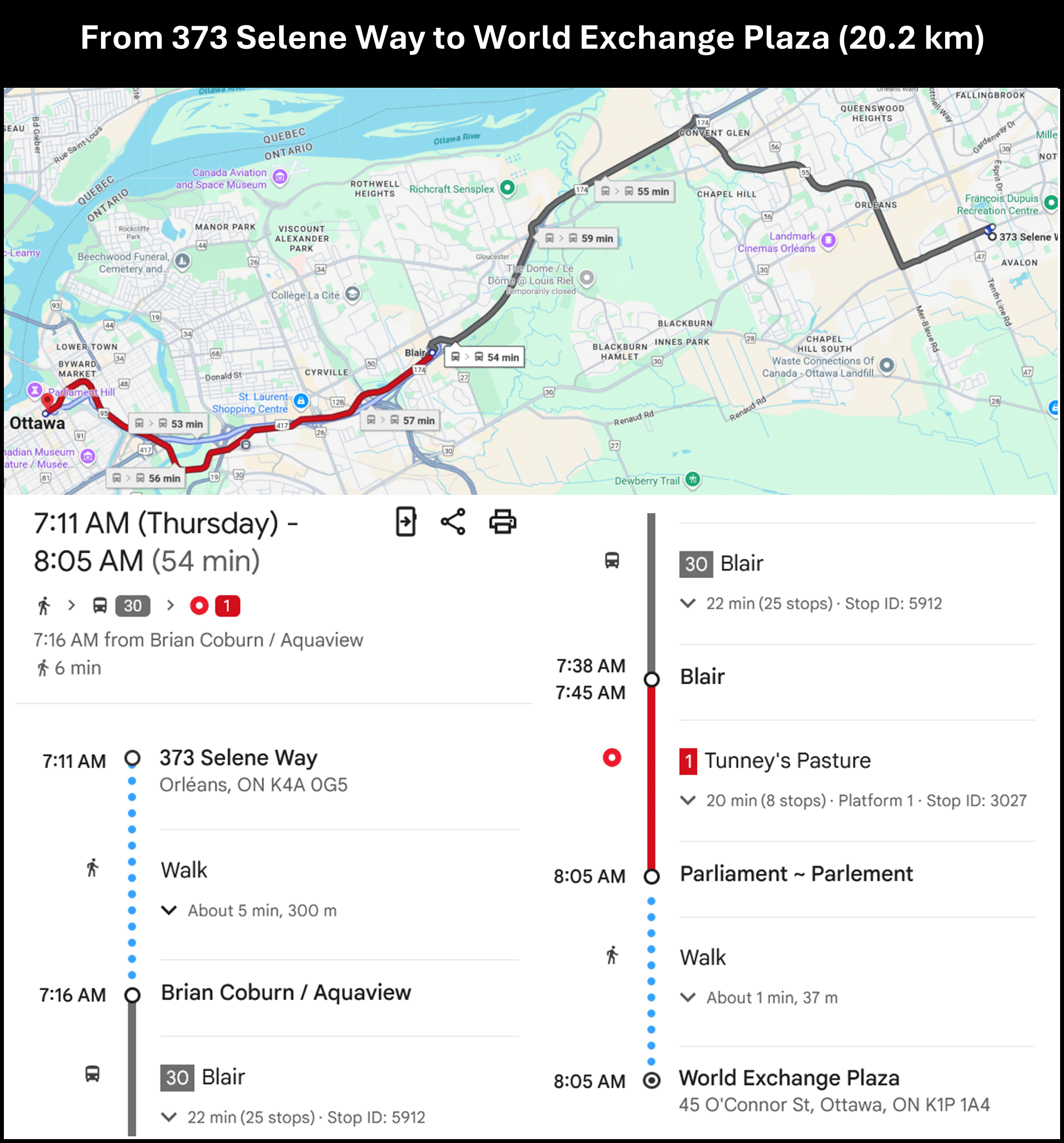
Orléans to Downtown: 54 minutes, 22-minute bus ride.
A ten-minute difference. The Orléans bus makes 25 stops over 22 minutes to reach Blair Station. The Stonebridge bus makes just 15 stops but takes 43 minutes to reach Tunney’s Pasture.
Both require one transfer to get downtown. So what’s the difference? Two things, actually. First, Stonebridge is just far from the western LRT terminus that bus has to cover massive distance. But second, and just as important: the route itself is less efficient. Ottawa is built as an east-west city. Highway 417 creates a natural rapid transit corridor for eastern neighborhoods like Orléans. Those buses can move. The southwestern routes? They’re threading through suburban streets without the same kind of arterial advantage.
International research shows that long feeder routes kill ridership even when transfers are minimal. When you’re spending 40+ minutes on a bus just to reach a train, regardless of how many stops it makes, you’re already losing before you board the LRT.
The city is full of these mismatches. Similar distances from downtown, wildly different experiences, driven by both how far you sit from an LRT station and whether your feeder route has decent infrastructure to get you there.
The Bank Street divide
Looking across all the neighborhood results, a pattern emerged that had nothing to do with distance. What if the East versus West Ottawa divide everyone talks about isn’t just cultural preference? What if it’s designed into the transit geometry?
Here’s where the data analysis got amusing. I tried to split Ottawa East-West using pure coordinates and ended up with Manotick in the East. Turns out Ottawa’s tilt along the St. Lawrence makes computers terrible at understanding local geography. Bank Street, though, that’s the natural divider. Draw a line down Bank Street, and you essentially split Ottawa into two different transit stories.
I plotted the same distance-versus-change analysis, but this time colored by which side of Bank Street each neighborhood sits on. The divide was immediate.
The Bank Street Divide – Transit Time Change vs. Distance to Downtown (West Side)
West of Bank Street, the results were dismal: only 2 of 50 neighborhoods saw faster transit times. Two.
Cross Bank Street heading east, and the picture changes. Improvements become markedly more common, especially in outer-urban eastern neighborhoods benefiting from the Confederation Line extension to Orléans.
The Bank Street Divide – Transit Time Change vs. Distance to Downtown (All Corridors)
The divide is stark. Western neighborhoods saw transit times jump by 17 minutes on average. Eastern neighborhoods? 8 minutes. More than twice the impact.
And this is just the Confederation Line to Orléans and the Trillium Line south. Phase 2 isn’t fully online yet. When it is, this gap will likely widen.
The explanation is simple: sequencing. Phase 1 brought the LRT east to Orléans. Eastern neighborhoods like Orléans Avalon and Blackburn Hamlet now have direct access to the rail spine. Western neighborhoods, Barrhaven, Stittsville, Kanata South, are still riding long bus routes to Tunney’s Pasture. They’re waiting for Phase 3’s western extension. Current price tag? An estimated $6 billion. Nearly as much as the $7 billion that built Phases 1 and 2 combined.
This is what phased infrastructure does. Early phases create winners. Later phases leave people waiting. And that wait isn’t just a delay. It’s years of longer commutes for everyone on the wrong side of the build sequence.
The Bank Street divide explained the geographic pattern but it didn’t answer the more important question: where does transit actually work? Not ‘less bad than average,’ but genuinely competitive with driving. Time to hunt for success stories.
Finding the bright spots
After documenting where transit failed, I wanted to find where it succeeded. Somewhere in those 97 neighborhoods, transit had to be competitive enough that people would choose it over driving.
I calculated the transit-to-car time ratio for every neighborhood to find that 1.5 threshold ratio where transit becomes competitive. When that ratio drops below 1.5, people choose transit even when they own cars. Above 2.0, transit is a last resort.
I expected maybe a handful of winners near downtown. What I found surprised me: 15 neighborhoods had cracked the code. Not five, which would be terrible. Not fifty or more, as we would hope. Fifteen.
Map 3 — Car vs Transit
Islands of blue and white in a sea of red. Fifteen neighborhoods in blue where transit competes. A few in white: the middle ground. And the rest? Deep red. Transit as a last resort. (Note: this analysis doesn’t account for parking time, which varies widely based on whether you have a reserved spot.)
The blue spots aren’t random. Each one is a place where one of many things have aligned: the local bus routes sync well with train schedules, transfers happen in the same station or across a platform (not a parking lot), and service runs frequently enough that you don’t need to check a schedule. These aren’t lucky accidents. They’re templates for what can be.
What measurement teaches us
After living with this data for weeks, and I mean really living with it, sharing more transit theory with my partner and toddlers than they ever wanted and gaining immense respect for transit engineers and statisticians alike, a few principles became impossible to ignore.
The bundle is the unit of design. Speed alone doesn’t create ridership. Neither does frequency. You need the whole package: competitive door-to-door times (≤1.5-1.75× car time), minimal transfers, comfort, reliable frequency, and reasonable walk distances. Miss one element and the others can’t compensate.
Bright spots are blueprints. Those 15 competitive neighborhoods aren’t lucky accidents. They’re instruction manuals. Lock in what makes them work. Study their operating patterns. Replicate them.
Public reporting builds trust. What if we tracked minutes-saved-per-dollar by route and neighbourhood, updated quarterly? What if we published time-ratio maps alongside ridership numbers? What if we made transfer penalties visible and measured them? Transparency changes behavior for transit agencies and riders alike.
The next wins are in the network. The $7 billion bought a spine. The question now is whether we’ll invest in the capillaries and leverage data to drive change: the local routes, transfer quality, and frequency that determine whether that spine actually works for people. If you have been on the LRT recently, you know it can be a pleasurable experience.
Beyond the binary
People ask: “Did Ottawa’s LRT investment make transit better?”
The data says: it depends entirely on where you live.
For the 18% of neighborhoods that improved: yes. For inner urban residents: roughly neutral. For many suburban neighbourhoods, especially west of Bank Street: demonstrably worse.
But asking “did it work?” misses the point. Ottawa didn’t get a uniform outcome. It got a geographic reshuffling of who wins and who loses. Some neighborhoods gained direct access to rapid transit. Others traded their functional bus routes for longer commutes with less frequent routes. Understanding why that happened matters more than tallying wins and losses.
This isn’t an argument against rail. It’s an argument for measuring what actually matters. Not just ridership numbers or kilometers of track built, but door-to-door travel times by neighborhood. Not just averages, but distributions. Not just whether the trains run on time, but whether people can actually get to those trains.
The $7 billion bought infrastructure. What we measure determines whether that infrastructure serves people.
You know that feeling when you look at an average and think, “that can’t be the whole story”? It never is. Behind every average is a distribution. Behind every distribution are real people trying to get to work. This analysis started with one number: 10 minutes slower. It ended with 97 different stories.
The data just told us what happened. What we do next is up to us.
“I started this analysis trying to understand a number: why 10 minutes slower? I ended up understanding a city. The patterns hidden in those 82,000 data points tell us exactly what worked, what didn’t, and what to fix. That’s the kind of puzzle I live for.”
Glendon Hass

Glendon Hass
Glendon is the Director of AI, Data & Automation at Bronson.AI. Over nearly a decade in technology and AI consulting, he’s accelerated digital adoption in federal government, led 150+ person teams building commerce platforms, and designed AI governance for Canada’s largest retailers. He’s a translator and generalist: equally comfortable in deep technical work or presenting business cases to the C-suite, thriving on challenges across industries.
He believes AI is a powerful tool, not magic: it unlocks value when supported by leadership buy-in, training, and change management. He’s spent his career finding stories that data tells, from hydrogen fuel cells to transit systems. If you’re wrestling with a complex challenge and need someone who thinks in systems and stories, reach out.

Mahtab Moghadam
Mahtab is the lead Data Scientist and Machine Learning expert at Bronson.AI. With a Master’s in Artificial Intelligence and a background in software engineering, she specializes in turning complex datasets into actionable insights. Her expertise spans machine learning, image processing, generative AI, and cloud-native data infrastructure: she’s SnowPro Core certified and works hands-on with orchestration platforms like Dagster, Apache Airflow, and Fivetran. Mahtab bridges technical and business teams, translating data complexity into clarity and delivering AI-driven solutions that create real-world impact.
