Quick Summary
Bronson supported the University of Manitoba’s Office of Fair Practices and Legal Affairs in operationalizing its Respectful Work and Learning Environment Policy and Sexual Assault Policy.
The engagement redesigned the institution’s formal complaints management process and developed a Standard Operating Procedures (SOP) document and supporting toolkit.
Bronson led executive-level meetings with Vice Presidents and Directors to align senior leadership on revised roles and responsibilities under the new process.
In a parallel policy stream, Bronson contributed to Guidelines for Intimate Relationships and developed a standardized report format and guidance for investigators.
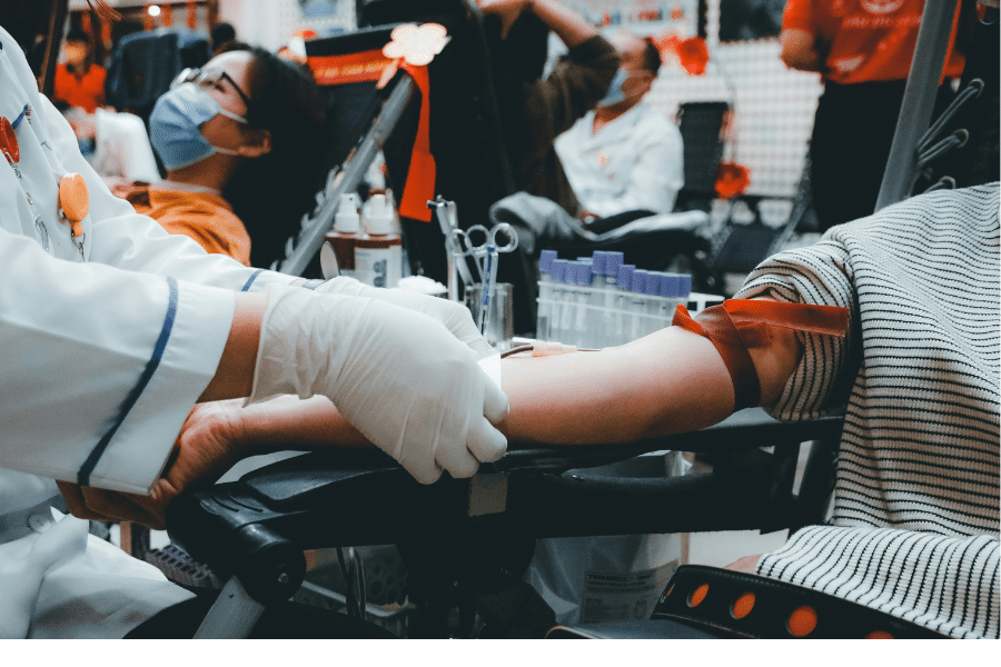
A proposal for a Campus Sexual Assault Resource Centre was developed, drawing on benchmarking and lessons learned from comparable centres at other U15 institutions.
Project Overview
The University of Manitoba’s Office of Fair Practices and Legal Affairs is responsible for implementing two of the institution’s most sensitive policies: the Respectful Work and Learning Environment Policy and the Sexual Assault Policy. As these policies were operationalized, the university identified significant gaps in how formal complaints were managed across the institution.
Roles and responsibilities were unclear. There were no structured Standard Operating Procedures. Toolkits to support consistent implementation across the university did not exist. The result was a complaints management system that was difficult to apply consistently, hard to explain to senior leadership, and vulnerable to gaps in execution.
The university required expert external support to redesign the formal complaints process, develop the documentation needed to operationalize it, and build awareness and alignment among senior leadership. Bronson was engaged to provide that comprehensive process improvement and policy support, working directly with the Office of Fair Practices and Legal Affairs and engaging senior university stakeholders throughout the engagement.
The Challenge