I get asked frequently: what’s the best model? What should we be using?
The honest answer is a very consulting “it depends”. Because a lot of models are genuinely good at a lot of different things. And then there’s the reality that most people at work don’t get to choose. Your enterprise is already on Microsoft, so you’re on Copilot. Your org picked Google, so it’s Gemini. The model is a given before you even open it.
On top of that, I keep hearing people are quietly impressed with Copilot on everyday tasks — but how does it hold up on more complex asks? And then there are the smaller labs doing fascinating work. Cohere, right here in Canada, just released a world-class open-source speech recognition model that topped the Automation Speech Recognition (ASR) leaderboard but their enterprise generative models are a generation behind the frontier labs. How does that show up in practice?
All of this led me to want to test with something I do a lot: turning messy data and text into visual outputs. One of the things Generative AI is genuinely unlocking is the ability to communicate anything visually, dashboards, reports, data stories, even if that’s not your core strength.
Same prompt. Same data dump. Cohere, Gemini 3.1, Copilot, Claude Opus 4.6, GPT 5.4. No coaching, no follow-ups, just “here’s a dump, make me a dashboard.”
See for yourself:
Every model has its own design instincts. What gets surfaced first, how data is grouped, colour choices, layout. Some were functional but forgettable. Cohere’s was rough, but they’re also working with an older model and clearly investing their energy in other areas where they’re leading. A couple of the others were surprisingly sharp.
And then there was GPT 5.4.
Good colour scheme, important data surfaced early, tabbed views for slicing things different ways. It went beyond what I asked for. The prevailing narrative is that GPT is terrible at UI compared to Claude, this dashboard challenges that directly. The taste it embedded was impressive.
But it took fifteen minutes to generate. More than every other model combined. And I still had to wait another five for it to finish rendering.
What if it had gotten it wrong?
Generative AI gets you to about 80% of the end result, give or take 15%.

Sometimes you land at 95% and it feels like magic. Sometimes you’re at 65% and the next four hours (and probably all your remaining usage) is spent wrestling it into shape.
GPT 5.4 happened to nail it in one shot. But that’s the exception. What if it had buried the key metrics, or picked the wrong chart types, or mangled the colour palette? Fifteen minutes burned and you’re starting over.
And this variance is one of the reasons people have such wildly diverging opinions about AI right now. Use a non-reasoning model from a year ago and you’re firmly in “this is overhyped” territory. Push a frontier model to its limits and you start to feel like AGI is around the corner. The gap between those two experiences is enormous, and it’s the same underlying technology.
Here’s what kept nagging at me after this experiment: I could probably get to the GPT 5.4 level of quality with a faster model and a few rounds of iteration. But that only works if I know what good looks like and can define it clearly enough for the model to act on. The model isn’t the bottleneck. The expertise is.
Writing down what your best people know
Ask me when you need great data storytelling and I’ll tell you it’s any time you’re trying to share something complex and need to invoke a response. When raw numbers aren’t enough, when you need people to feel the significance, not just see it. Ask me what great data storytelling looks like and I’ll talk about Hans Rosling weaving narrative through data in a way that changed how people saw the world. I’ll point you to Cole Nussbaumer Knaflic’s Storytelling with Data. I’ll tell you why pie charts are almost always the wrong choice.
All of that, the when to use it, the what good looks like, the references, the opinions, the taste, is the kind of knowledge you get from sitting down with someone over coffee and saying “tell me about this.” They walk you through how they think. They recommend a book. They tell you what to avoid and why.
Last fall, Anthropic released a framework called skills that encodes exactly this kind of domain expertise; portable, reusable, model-agnostic. Think of it like onboarding a smart junior: here’s how we think about this domain, here’s what good looks like, here’s why we do it this way and not that way. Skills capture the conversation you’d have with your best person and make it something any model can use.
When I saw that announcement the importance and value of skills were readily apparent to me, because it perfectly describes how expertise already works in practice. It’s how you’d transfer knowledge today if you had the time to sit with every person on your team. Skills make it executable and scalable.

We proved this out with a federal organization in a regulated environment. Encoding expert reasoning into a skill, running on a mid-tier model, not the most powerful one available, outperformed months of traditional NLP optimization. Measurably. The details are worth hearing in person.
Process documents and protocols are fine, but they’re fragile. They sit in SharePoint and nobody reads them. Skills are the operational layer that actually runs. They take what your best people know and make it work across teams, across models. And they compound as you refine them.
Come see the dashboards. Stay for the bigger conversation.
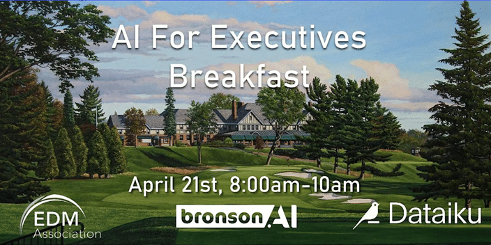
Ottawa Public Sector Executives – I’ll be walking through all five dashboards live at our upcoming executive breakfast, what each model got right, what it got wrong, and what the spread tells us about where AI actually is right now.
But the dashboards are the hook, not the point. The real conversation is about what happens when you stop worrying about which model is best and start capturing what your people actually know and making it run.
Click here to register: